Thursday, June 10, 2010

Paul Pope

Paul Pope (born September 25, 1970) is an Americancomic book artist. Influenced by Ray BradburyEdgar Rice Burroughs[citation needed], Pope's stories evoke poignant, under-explored aspects of youth culture. Pope describes his own influences (listed in his book P-City Parade) as Daniel Torres, Bruno Premiani, Jack Kirby, Alex Toth, Tony Salmons, Hugo Pratt, Silvio Cadelo, Vittorio Giardino, and Hergé.

Pope introduced THB in 1995, the same year he began work for Kodansha, Japan's best-known manga publisher. Pope eventually developed the manga Supertrouble for Kodansha, which mined the "cutie-pie" girl adventure vein that THB exists in. Pope has self-published some of his work through is own Horse Press, with other work such as One-Trick Ripoff coming from Dark Horse ComicsHeavy Liquid and 100% published under DC Comics' Vertigo and imprint.

Pope's work combines the precision and romance of the European artists he studies with the energy and page design of the manga tradition. His storytelling narratives continue to mature with well-paced, deftly-shaded combinations of science fiction, hardboiled crime stories and the Romeo and Juliet archetype. Pope's two protagonist types are the silent, lanky outsider male of One-Trick Ripoff, Escapo and Heavy Liquid, or the resourceful, aggressive, humorous young teenage girls of THB.

In 2006, Pope received an Eisner Award for Best Short Story for his work, "Teenage Sidekick", published in Solo #3. In 2007, Pope won two additional Eisners, Best Writer/Artist and Best Limited Series, for his Batman mini-series, Batman: Year 100. Discussing the story, which is set in 2039, one hundred years after the first appearance of the caped crusader, Pope said: "I wanted to present a new take on Batman, who is without a doubt a mythic figure in our pop-psyche. My Batman is not only totally science fiction, he's also a very physical superhero: he bleeds, he sweats, he eats. He's someone born into an over-arching police state; someone with the body of David Beckham, the brain of Tesla, and the wealth of Howard Hughes... pretending to be Nosferatu." The story, colored by José Villarrubia, was originally presented in a four-part prestige format in 2006. DC Comics later published a trade paperback collecting Batman: Year 100 in early 2007. The trade also includes Pope's "Berlin Batman" story from The Batman Chronicles No. 11. "Berlin Batman" involves a version of Batman who lives in the German Weimar Republic on the eve of World War II. The Weimar Batman helps keep the papers of Austrian School economist Ludwig von Mises from falling into Nazi hands. Both Batman stories in the collection reflect implicit libertarian themes that often appear in Pope's work.[1] He also wrote one of the comics for Toonami's website.[2]

Aside from comics, in the fall of 2006 Pope worked with Italian clothing company Diesel on a big store installation during their fall fashion week campaign, and a screenprint series based on their 'Chelsea Hotel' campaign as a 51st birthday present to Diesel's founder, Renzo Rosso. In the fall of 2008, Pope went a step further by partnering with DKNY to create the DKNY:2089 collection.

Pope's first art book titled Pulphope: The Art of Paul Pope came out in June 2007. A collection of his most representative work, the 224 page hardcover was published by AdHouse Books. Pope has also announced the pending publication of two original graphic novels, Battling Boy from First Second Books, and La Chica Bionica from French publisher Dargaud.

In 2009, Pope was featured in The Cartoonist, a documentary film on the life and work of Jeff Smith, creator of Bone.[3]

Born in Philadelphia, Pope grew up in Bowling Green, Ohio, with stops in Columbus, Ohio, San Francisco, and Toronto in-between; Pope now lives and works in New York City.


Paul Pope didn't wait for anyone to discover him. The Ohio native kicked his way into comics during the mid-'90s self-publishing boom with work that included "THB" -- his as-yet-unfinished sci-fi adventure about a 13-year-old girl running from robots and bureaucrats on Mars. He's since followed that up with hit books that include "The One-Trick Rip-Off," "Escapo," "Heavy Liquid," "100%," the Adam Strange story in "Wednesday Comics" and most famously "Batman: Year 100."

Pope stood out in the mid-'90s for a number of reasons. He was one of the few Americans at the time to work in-house at Japanese megapublisher Kodansha -- and his crazy-fluid style and mammoth page counts merged European, Japanese and American comics styles in a way that proved prophetic. (I'd argue "Scott Pilgrim" and its ilk owe a lot to Pope's groundwork, consciously or un-.) Pope also had fun playing with personas and the notions of what a comics artist can be: He put cheeky rock-star photos of himself in his comics, gave himself Ziggy Stardust-style names like "Pulphope" and "Comics Destroyer," and took his illustration into the realms of rock and fashion in New York, where he now resides. Pope is currently working on three big projects. For First Second, he's writing and drawing "Battling Boy" -- his young-adult graphic novel about a kid superhero fighting monsters for hundreds of pages -- and "Total THB," a partial redraw of "THB" that will finally conclude that series. He's also working on "Psychenaut," a dream-analysis project for French publisher Dargaud.

Pope is making a rare guest appearance this weekend at the Stumptown Comics Fest in Portland, Oregon -- with two-hour signings on Saturday and Sunday, April 24-25. (I'm told he'll be selling his limited-edition vinyl toy, "The Masked Karimbah.") On Sunday, he'll also give a talk with a Q&A. Then, on Sunday night, Pope will DJ and show his experimental sci-fi mashup film "Psychenaut" (a different project than the French comic) on the main floor of the Bossanova Ballroom during the "Stumptown Volunteer Appreciation and After Fest Party." Pope's girlfriend, the New York burlesque and circus performer Harvest Moon, is coming to Portland with him; she's performing at the Bossanova at "The Royal Tease" (April 24) and "Dr. Sketchy's Anti-Art School" (April 25).

When we spoke last week, Pope had just wrapped a deadline for a French magazine. We talked for an hour-and-a-half while he walked around New York. ("I'm like The Fonz," he joked. "The street's like my office.") Topics of conversation: "Battling Boy," "Psychenaut," burlesque, manga, sex in comics, the ultimate Bat-Cycle, how to draw 70 pages in a month, "THB," Moebius, "Close Encounters," Jeff Smith, what makes a good superhero movie, and how to make toys, camouflage and a rock-star comics persona. An edited transcript follows.

Oh, and we also talked about Pope's surprising connection with AICN's own Mr. Beaks....

-- Mike Russell, www.CulturePulp.com

MIKE RUSSELL: AICN editor Jeremy Smith [a.k.a. "Mr. Beaks"] has surprising connection to you: Your grandfather is a friend and former colleague of Jeremy's father. His dad used to assist your grandfather in surgery.
PAUL POPE: Oh, yeah. I totally remember Jeremy from the old days.
RUSSELL: When I pitched this interview, Beaks wrote back: "I remember seeing a press release Paul wrote and illustrated for his grandfather's sod-laying machine in the early '90s."
POPE: Well, you know, my granddad was an inventor. I think my work ethic comes from him -- and probably an understanding of mechanics.

RUSSELL: I remember when you wrote about checking out some actual flying cars while doing research for a "Fantastic Four" story.
POPE: Oh, yeah. The car I used for that story was designed by Chip Foose, who did all the design work for Pixar for "Cars." Very cool.

RUSSELL: I'm reminded of your "Batman: Year 100" motorcycle. I'm guessing Christopher Nolan reached for that when they were designing the Bat-Pod for "The Dark Knight."
POPE: My cousin Sterling works at Ford -- and at the time I was working on "Batman," he was designing suspension systems. So we sat down together, and I said, "Sterling, imagine I've got a billion dollars. I'm going to hire you to make the most badass bike. Money is not an issue. Just design the ultimate concept bike."

He said, "Well, we're going to start with titanium as the base."

I was like, "Cool."

And so we designed it. He has a credit in the book.

And the coroner in "Batman: Year 100" is based on my granddad. He was a forensic coroner. Kind of a multitasker. It was possible for him to also be an engineer and a farmer at the same time.

RUSSELL: Now, I know Harvest Moon is coming out to Stumptown with you. What has your association with Harvest Moon -- and working with her on stuff like "Shakedown" -- brought to your art? What has New York City brought to your art?
POPE: It's funny, living in New York, because I meet so many students from FIT and all these different art schools. I'm involved in a world of other art-school trained cartoonists. Where I came from was such a different vibe. Growing up in Ohio, I felt like I was pretty much the only guy from my background who was really into comics. It was a little bit isolating, you know?

I always look for artists with one toe in what I call "heroic realism" or figure-based draftsmanship, and I always loved Toulouse-Lautrec. And now that I'm involved not only with a performer, but in a world of performers, I'm able to actually see the kinds of things that Lautrec might have seen. I want to make this contemporary, and I want to add a bit of graphics flair to the live performance, which doesn't really have a document. I mean, people can photograph it, but....

I have friends who are sideshow performers out at Coney Island -- and, you know, they're professional freaks. It's cool. And because I'm not a performer, I always wonder what I can give back to this world that I'm living in. There's a sort of warmth to having an artist there, documenting it -- not just photographing it, but eliciting a feeling of what it's like to be here via pictures.

RUSSELL: I was covering a community-theater production for a small newspaper I used to work for, and I found out Val Mayerik was in the cast -- the cartoonist who first drew Howard the Duck. He was a supporting player in what I recall was this little chamber murder mystery. I asked him why he was doing it, and he said, "Drawing gets really lonely. This is a nice release."
POPE: Yeah. I can see that.
RUSSELL: I'm reminded of an interview you gave where you talked about how Harvest Moon gets applause for her burlesque work as she does it, but you have to sort of carry the applause around in your head.
POPE: Yeah. And I haven't fully assimilated the digital-immersion factor, either. You have to fight more to have peace of mind than you used to. I'm not totally comfortable with that, but it's necessary. That's the next decade's worth of trouble -- cracking that code.

RUSSELL: You were an early evangelist in the '90s for bringing European and Japanese influences into American comics-making. In the post-Internet era, this cross-pollination is widespread. You personally had to travel to find that stuff -- and now someone can look up Hugo Pratt, Guido Crepax and "Rocco Vargas" [all influences on Pope's work] from anywhere in the world. You've written about wanting a "world comic" drawing in every global influence. Has that dream come to fruition?
POPE: I'd say no. To me, the concept of a "world comic" is there to be a starting point, not an endpoint. The best thing comics can be is a launching point -- it's the point where we let the arrow from the bow, but it can never be the bull's eye. Art is not nihilistic -- we're never going to see the end of it.

I reject this stupid postmodern notion that art is dead and all we can do is recombine things. I hate that because it shows a lack of creativity on the part of the people saying it. Gosh -- I feel very benevolent and gregarious toward the big question-mark of the future when it comes to art.

I tend to think I'm fairly modern in the capital-M sense. A lot of my concerns are fairly critical of technology and the changes that it's bringing without giving society time to process what those changes mean. So I do feel a sort of black bird of warning on my shoulder all the time. But at the same time, I have to feel generous toward the future. I haven't figured out the game yet, but a lot of good, smart people are getting into it.

RUSSELL: I want to talk about your work process. What's your record for monthly page output? Because you've said it was 70 pages.
POPE: [laughs] Something like that.
RUSSELL: Seventy pages in one month. How the fuck did you do that?
POPE: You pretty much just put the seat-belt on. It's like having a one-month plane-ride. But that was what was needed -- it was a serious testing ground. This was in 1999, 2000.
RUSSELL: This happened during your years working with Kodansha?
POPE: Yeah, toward the end of it. A lot of those guys [working for Kodansha] approached making manga more like a TV studio -- where you had maybe 15 employees. But in the case of myself and Masashi Tanaka. the guy who did the book "Gon" -- remember that? With the dinosaur? --
RUSSELL: Yeah, yeah.
POPE: -- We were the only guys working for Kodansha who were working solo at the time. So Tanaka was pretty much my only role model. Him and Jack Kirby. I thought, "Jack Kirby did it while raising four kids; it shouldn't be that tough for me" -- I was only 28 or 29 -- "I can do this."

I mean, it didn't look very good -- it wasn't pristine. It wasn't Barry Windsor-Smith having six months to do a page. But that's not what's necessary in manga. Culturally, it's totally different, the way they perceive comics. To me, manga's a different thing, totally -- it's a cousin of comics.

RUSSELL: You've written quite a bit about your years on contract with Kodansha, starting in 1995. You created hundreds of pages of work for them over a period of years and only saw -- what? 14 pages of "Supertrouble" published? [NOTE: "Supertrouble" was a sort of alternate-universe, sillier version of "THB" that Pope wrote and drew for Kodansha. -- Ed.] I can imagine that was incredibly frustrating, but you still speak of it as a major formative period for your work.
POPE: Oh, yeah. I mean, it can't be bad -- I came back, and I'd learned a bunch of stuff that no one else knew. Seriously. I mean, not many guys in the West can say they spent time over there and worked inside the mainstream Japanese publishing system for manga, and had a table, translators and editors. You've got to make something of that.
RUSSELL: And you see the change immediately in your work -- watching the way "THB" changes in the way it looks and reads. I know for me, it was looking at "The One Trick Rip-Off" and saying, "Oh -- something different is happening here."
POPE: Yeah. Something clicked there. It's true.

Found Here: http://www.aintitcool.com/node/44724


Tuesday, April 27, 2010

Karel Funk


Anyone who has ever ridden the New York subway at rush hour knows the feeling of being pressed so close to your fellow commuters that you can see their every pore, shaving nick and flaking follicle. To artist Karel Funk, newly arrived in Manhattan from his native Winnipeg, Manitoba, in 2001, that proximity to strangers on a train proved overwhelming at first—then career changing. He’d been toying with suburban angst in his paintings but felt that route was already well traveled by others. In urban voyeurism, however, he knew he had found his ideal subject.

“I was fascinated by how this boundary of personal space completely disappeared on the subway,” Funk recalls by phone from his home in Winnipeg, where he returned in 2003 and works in a studio in the basement of his house. “You could see details of somebody’s ear or neck that you’d never observe just socializing with friends because there’s this boundary we all keep.”

It’s those close encounters with strangers that inspire Funk’s hyper-realist, neo-Renaissance portraits of young urbanites, the latest of which go on view in April at New York’s 303 Gallery. “I wanted to convey that moment when you’re forced to look intimately at the back of a stranger’s head, but I didn’t want there to be any emotional connection,” says Funk, who depicts minute details like an acne scar or a fabric fold with exquisite, microscopic clarity, applying sometimes up to a hundred layers of acrylic to a wood panel. To Carter Foster, curator of drawings at the Whitney Museum of American Art, which owns a Funk, the 38-year-old artist “comes close to [Edward] Hopper in the way his works implicate the viewer as a kind of voyeur.”

Yet even as he allows us to scrutinize his subjects, Funk reveals little of their lives. His paintings are firmly rooted in the history of portraiture, he says, acknowledging his debt to Renaissance masters such as Holbein and Bronzino, with their focus on precise detail and brushwork. And like those artists, he pays great attention to what his subjects wear, seeing the jackets and hoodies he provides them as modern-day armor and shields.

But unlike traditional portraiture, in which the subject typically locks eyes with the viewer and background details provide clues about them, Funk’s subjects face away from us or have their eyes closed, as if they’re unaware of our presence.

“As soon as you see a face—there might be some tension in the eyes or mouth—there’s a story, a feeling,” he says. By obscuring the face or cloaking it altogether as Funk does, “it becomes very hard to find a specific narrative or emotion about that person,” he notes. “My paintings give you very little. There’s nothing there to connect with except for the formal qualities, the texture of skin, hair or clothing, and the questions you’re left with about ‘Who is that person?’”

Found Here: http://www.wmagazine.com/artdesign/2010/03/karel_funk

Friday, April 9, 2010

Paul Gustave Doré / January 6, 1832 – January 23, 1883

Gustave Dore was born in Strasbourg in 1832. He became a book illustrator in Paris and his commissions included work by Rabelais, Balzac and Dante. In 1853 he was asked to illustrate the works of Lord Byron. This was followed by other work for British publishers including a new illustrated English Bible.

Dore's English Bible (1865) was a great success and in 1867 Gustave Dore had a major exhibition of his work in London. This led to the foundation of the Dore Gallery in New Bond Street.

In 1869, Blanchard Jerrold, the son of Douglas Jerrold, suggested that they worked together to produce a comprehensive portrait of London. Jerrold had got the idea from The Microcosm of London, that had been produced by Rudolf Ackermann, William Pyne and Thomas Rowlandson in 1808.

Dore signed a five-year project with he publishers, Grant & Co, that involved him staying in London for three months a year. Dore was paid the vast sum of £10,000 a year for the proposed art work. The book, London: A Pilgrimage, with 180 engravings by Dore, was eventually published in 1872.

Although a commercial success, many of the critics disliked the book. Several were upset that Dore had appeared to concentrate on the poverty that existed in London. Gustave Dore was accused by the Art Journal of "inventing rather than copying". The Westminster Review claimed that " Dore gives us sketches in which the commonest, the vulgarest external features are set down".

London: A Pilgrimage was a financial success and Dore received commissions from other British publishers. Dore's later work included Paradise Lost, The Idylls of the King and The Works of Thomas Hood. His work also appeared in the Illustrated London News. Dore continued to illustrate books until his death in 1883.

Found Here: http://www.spartacus.schoolnet.co.uk/Jdore.htm

Paul Gustave Doré (French pronunciation: [pɔl ɡystav dɔʁe]; January 6, 1832 – January 23, 1883) was a French artist, engraver, illustrator and sculptor. Doré worked primarily with wood engraving and steel engraving.

Doré was born in Strasbourg and his first illustrated story was published at the age of fifteen. At age five he was a prodigy artist already creating drawings. When he turned 12 he began to carve his art in stone. Doré began work as a literary illustrator in Paris. Doré commissions include works by Rabelais, Balzac, Milton and Dante. In 1853 Doré was asked to illustrate the works of Lord Byron. This commission was followed by additional work for British publishers, including a new illustrated English Bible. In 1863, Doré illustrated a French edition of Cervantes's Don Quixote, and his illustrations of the knight and his squire Sancho Panza have become so famous that they have influenced subsequent readers, artists, and stage and film directors' ideas of the physical "look" of the two characters. Doré also illustrated an oversized edition of Edgar Allan Poe's "The Raven", an endeavor that earned him 30,000 francs from publisher Harper & Brothers in 1883.[1]

Doré's English Bible (1866) was a great success, and in 1867 Doré had a major exhibition of his work in London. This exhibition led to the foundation of the Doré Gallery in New Bond Street. In 1869, Blanchard Jerrold, the son of Douglas William Jerrold, suggested that they work together to produce a comprehensive portrait of London. Jerrold had gotten the idea from The Microcosm of London produced by Rudolph Ackermann, William Pyne, and Thomas Rowlandson in 1808. Doré signed a five-year project with the publishers Grant & Co that involved his staying in London for three months a year. He was paid the vast sum of £10,000 a year for his work. He was mainly known for his paintings, contrary to popular belief about his wood carvings. His paintings are world renowned, but his woodcuts are where he really excelled.

The book, London: A Pilgrimage, with 180 engravings, was published in 1872. It enjoyed commercial success, but the work was disliked by many contemporary critics. Some critics were concerned with the fact that Doré appeared to focus on poverty that existed in London. Doré was accused by the Art Journal of "inventing rather than copying." The Westminster Review claimed that "Doré gives us sketches in which the commonest, the vulgarest external features are set down." The book was also a financial success, and Doré received commissions from other British publishers. Doré's later works included Coleridge's Rime of the Ancient Mariner, Milton's Paradise Lost, Tennyson's The Idylls of the King, The Works of Thomas Hood, and The Divine Comedy. His work also appeared in the Illustrated London News. Doré continued to illustrate books until his death in Paris in 1883. He is buried in the city's Père Lachaise Cemetery.

Found Here: http://en.wikipedia.org/wiki/Gustave_Dor%C3%A9

Images Found Here: http://texttribe.com/gallery/Gustave_Dore/index_Dante_Divine_Comedy.htm

Monday, March 22, 2010

Phobos Imaged by HiRise

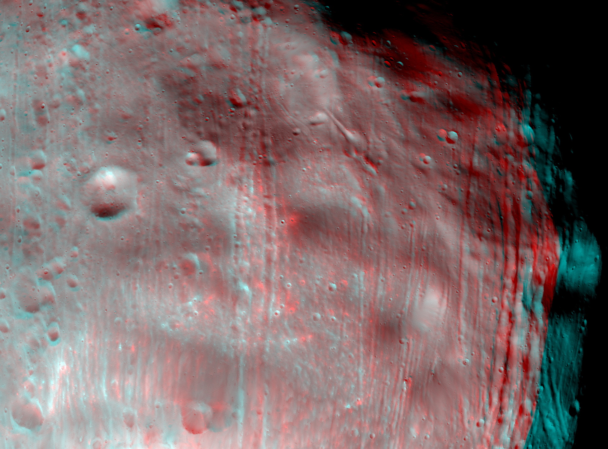
HiRISE acquired two dramatic views of the Martian moon, Phobos, on 23 March 2008. Observation PSP_007769_9010, acquired at a distance of 6,800 kilometers from Phobos, provides surface detail at 6.8 m/pixel scale and a object diameter of about 3,200 pixels. The second observation, PSP_007769_9015 providing a closer look at 5,800 km, views the surface at slightly more detail (5.8 m/pixel with an object diameter of about 4,000 pixels).

The two images were taken within 10 minutes of each other and show roughly the same features, but from a different angle so that they can be combined to yield a stereo view. (Watch a short clip of both observations: 204KB, QuickTime.)

The illuminated part of Phobos visible in the images is about 21 km across. Images from previous spacecraft have been of smaller pixel scale (for example, Mars Global Surveyor got data at 4 m/pixel, because this spacecraft came closer to Phobos), but the HiRISE images have greater signal-to-noise, making the new data some of the best ever for Phobos.

The most prominent feature in the images is the large impact crater Stickney, in the lower right. With a diameter of 9 km, it is the largest feature on Phobos. A series of grooves and crater chains is obvious on the other parts of the moon. Although many appear radial to Stickney in the images, previous studies show that the grooves radiate from a different point on Phobos. Hypotheses for their formation vary. Some scientists believe the grooves and crater chains are related to the formation of Stickney, whereas others think they may have formed from ejecta from impacts on Mars that later collided with Phobos. The lineated textures on the walls of Stickney and other large craters are landslides formed from materials falling into the crater interiors in the weak Phobos gravity (less than 1/1000th the gravity on Earth)

Found Here: http://hirise.lpl.arizona.edu/phobos.php


Here (below) are the "global" coordinates and orbital vector for this ESA Phobos image -- as prepared by Enterprise Associate, Greg Ahrens ....

An extraordinary, geometric, clearly artificial, fractured 3-D surface ... lying just beneath the veneer of "battered, ancient asteroid stuff" that Phobos presents from most other viewing angles -- all now stunningly revealed (below) ... in this high-resolution Mars Express Phobos "face-on" image!

So ... what are these obvious (see below) "grooves of Phobos?"

This fascinating mystery ... evident in the Viking images (above) as "a series of obvious, long, narrow and mysteriously-straight striations ..." -- running parallel across almost the entire visible width of this ~15-mile-wide moon -- was eventually interpreted by NASA as merely "crater-chains of secondary meteor impacts ... caused by Phobos intersecting [running into] such meteor streams ... blasted-out across Phobos' orbit ... as fragments from primary asteroid or comet impacts down on Mars' surface ...."

Now, from this latest Mars Express ultra-high-resolution imaging ( below) -- the REAL cause of these mysterious "grooves on Phobos" is readily, geometrically apparent--

Phobos -- as a clearly "artificial moon"--

"Is literally ... Coming Apart at the Seams!"

Because of the increasing, shearing gravitational forces -- caused by its slow "death spiral" into Mars--

Because of the inevitable--

"Tides ... of Mars."

So yes, what you are staring at (probably, in shock at this point ...) is, in fact ... nothing less than what we've been saying all along ... since trying to educate the first Bush Administration on this data, in 1989 (see below):

That Phobos is, in fact--

An "ancient ... ex terrestrial ... very battered ... 15-mile-long"--

Spaceship.

Exactly like ... "Yonada."

Which now (according to our European sources -- backed up by the actual Mars Express data itself, which you will see more of - below) ESA is about to officially ... publicly announce!

Possibly -- even before President Obama's up-coming ... suddenly-called ... STILL super-secret "Space Summit"--

Which is scheduled to take place, within a few days, at the Kennedy Space Center -- personally hosted by the President of the United States of America -- in the middle of an on-going shuttle mission--

STS-131.

Which, turns out to be ... the 33rd Space Shuttle Mission ... to the Space Station ("ISS").

Can you say "the Fix is in" ... for "something?"

Found Here: http://gazbom.blogspot.com/2010/04/old-space-station-destroyed-in-battle.html


Wednesday, March 17, 2010

Bush Monkey Portrait - Chris Savido 2004

Chris Savido (born Wilkinsburg, Pennsylvania) is an American artist whose acrylic portrait of George W. Bush composed of monkeys created controversy when the managers of Chelsea Market closed down the "ANIMAL'S PARADISE" art exhibition[1] there because of it. It was later auctioned on eBay. There was debate over whether the closing of the show constituted censorship. Supporters of the managers claimed that Chelsea Market was private, and thus management had a right to exclude the painting, while supporters of Savido "[looked] into the degree to which the Chelsea Market walkways are legally definable as 'public space,' and, as such, fully protected by the First Amendment."[1] Anonymous donors later paid for a digital billboard over the Holland Tunnel to show a detail of the painting.[citation needed]

Found Here: http://en.wikipedia.org/wiki/Chris_Savido
New York Art Shuttered After Bush Monkey Portrait
by Larry Fine

NEW YORK - A portrait of President Bush using monkeys to form his image led to the closure of a New York art exhibition over the weekend and anguished protests on Monday over freedom of expression.


Twenty-three-year-old painter Christopher Savido poses with his painting 'Bush Monkeys,' a portrait of President Bush, at the Animal gallery on New York City's Lower East Side, December 13, 2004. The portrait of Bush using monkeys to form his image led to the closure of a New York art exhibition over the weekend and anguished protests on Monday over freedom of expression. (Mike Segar/Reuters)
"Bush Monkeys," a small acrylic on canvas by Chris Savido, created the stir at the Chelsea Market public space, leading the market's managers to close down the 60-piece show that was scheduled to stay up for the next month.

The show featured art from the upcoming issue of Animal Magazine, a quarterly publication featuring emerging artists.

"We had tons of people, like more than 2,000 people show up for the opening on Thursday night," said show organizer Bucky Turco. "Then this manager saw the piece and the guy just kind of flipped out. 'The show is over. Get this work down or I'm gonna arrest you,' he said. It's been kind of wild."

Turco took the show down on Saturday and moved the art work to his small downtown Animal Gallery. Calls to the management of Chelsea Market for comment were not returned.

From afar, the painting offers a likeness of Bush, but when you get closer you see the image is made up of chimpanzees or monkeys swimming in a marsh.

Savido, 23, said he was surprised by the strong reaction to his painting, listed in the catalog at $3,500.

"It seems like people got a kick out of it," Savido said. "When they really see it, they almost do a double-take. I like to get a reaction from people."

The Pittsburgh, Pennsylvania-bred artist said he was happy for all the attention paid to his work but said the decision to shutter the exhibit was "a blatant act of censorship."

Savido plans to auction the painting and donate proceeds to an organization dedicated to freedom of expression.

"This is much deeper than art. This is fundamental American rights, freedom of speech," Savido said. "To see that something like this can happen, especially in a place like New York City is mind boggling and scary."

Found Here: http://www.commondreams.org/headlines04/1214-03.htm

Tuesday, March 9, 2010

The Voynich manuscript

The overall impression given by the surviving leaves of the manuscript suggests that it was meant to serve as a pharmacopoeia or to address topics in medieval or early modern medicine. However, the puzzling details of illustrations have fueled many theories about the book's origins, the contents of its text, and the purpose for which it was intended. Here are only a few of them:

    Herbal - The first section of the book is almost certainly an herbal, but attempts to identify the plants, either with actual specimens or with the stylized drawings of contemporary herbals, have largely failed. Only a couple of plants (including a wild pansy and the maidenhair fern) can be identified with some certainty. Those "herbal" pictures that match "pharmacological" sketches appear to be "clean copies" of these, except that missing parts were completed with improbable-looking details. In fact, many of the plants seem to be composite: the roots of one species have been fastened to the leaves of another, with flowers from a third.

    Sunflowers - Brumbaugh believed that one illustration depicted a New World sunflower, which would help date the manuscript and open up intriguing possibilities for its origin. However, the resemblance is slight, especially when compared to the original wild species; and, since the scale of the drawing is not known, the plant could be many other members of the same family - which includes the common daisy, chamomile, and many other species from all over the world.

    Alchemy - The basins and tubes in the "biological" section may seem to indicate a connection to alchemy, which would also be relevant if the book contained instructions on the preparation of medical compounds. However, alchemical books of the period share a common pictorial language, where processes and materials are represented by specific images (eagle, toad, man in tomb, couple in bed, etc.) or standard textual symbols (circle with cross, etc.); and none of these could be convincingly identified in the Voynich manuscript.

    Astrological herbal - Astrological considerations frequently played a prominent role in herb gathering, blood-letting and other medical procedures common during the likeliest dates of the manuscript (see, for instance, Nicholas Culpeper's books). However, apart from the obvious Zodiac symbols, and one diagram possibly showing the classical planets, no one has been able to interpret the illustrations within known astrological traditions (European or otherwise).

    Microscopes and telescopes - A circular drawing in the "astronomical" section depicts an irregularly shaped object with four curved arms, which some have interpreted as a picture of a galaxy that could only be obtained with a telescope. Other drawings were interpreted as cells seen through a microscope. This would suggest an early modern, rather than a medieval, date for the manuscript's origin. However, the resemblance is rather questionable: on close inspection, the central part of the "galaxy" looks rather like a pool of water.

    Found Here: http://www.crystalinks.com/voynich.html


The Voynich manuscript is a mysterious book thought to have been written in the 15th or 16th century and comprising about 240 vellum pages of handwritten text,[1] of which the majority have illustrations.[2] The text of the manuscript has never been deciphered, and the author, script, and language remain unknown.

Since its recorded existence, the Voynich manuscript has been the object of intense study by many professional and amateur cryptographers, including some top American and Britishcodebreakers of World War II fame, all of whom failed to decrypt any portion of the text. This string of failures has turned the Voynich manuscript into a famous subject of historical cryptology, but it has also given weight to the theory that the book is simply an elaborate hoax—a meaningless sequence of arbitrary symbols.

The book is named after the Polish-American book dealer Wilfrid M. Voynich, who acquired it in 1912. Currently the Voynich manuscript is stored in the Beinecke Rare Book and Manuscript Library of Yale University as item "MS 408". The first facsimile edition was published in 2005.[3]

The peculiar internal structure of Voynich manuscript "words" has led William F. Friedman and John Tiltman to arrive independently at the conjecture that the text could be a constructed language in the plain—specifically, a philosophical or a priori language. In languages of this class, the vocabulary is organized according to a category system, so that the general meaning of a word can be deduced from its sequence of letters. For example, in the modern constructed language Ro, bofo- is the category of colors, and any word beginning with those letters would name a color: so red is bofoc, and yellow is bofof. (This is an extreme version of the Library of Congress Classification used by many libraries—in which, say, P stands for language and literature, PA for Greek and Latin, PC for Romance languages, etc.)

This concept is quite old, as attested by John Wilkins's Philosophical Language (1668), but still postdates the generally accepted origin of the Voynich manuscript by two centuries. In most known examples, categories are subdivided by adding suffixes; as a consequence, a text in a particular subject would have many words with similar prefixes—for example, all plant names would begin with the similar letters, and likewise for all diseases, etc. This feature could then explain the repetitious nature of the Voynich text. However, no one has been able yet to assign a plausible meaning to any prefix or suffix in the Voynich manuscript.

In his book Solution of the Voynich Manuscript: A liturgical Manual for the Endura Rite of the Cathari Heresy, the Cult of Isis (1987), Leo Levitov declared the manuscript a plaintext[25] This he defined as "a literary language which would be understandable to people who did not understand Latin and to whom this language could be read." His proposed decryption has three Voynich letters making a syllable, to produce a series of syllables that form a mixture of Middle Dutch with many borrowed Old French and Old High German words. transcription of a "polyglot oral tongue".

According to Levitov, the rite of Endura was none other than the assisted suicide ritual for people already believed to be near death, famously associated with the Cathar faith (although the reality of this ritual is also in question). He explains that the chimerical plants are not meant to represent any species of flora, but are secret symbols of the faith. The women in the basins with elaborate plumbing represent the suicide ritual itself, which he believed involved venesection: the cutting of a vein to allow the blood to drain into a warm bath. The constellations with no celestial analogue are representative of the stars in Isis' mantle.

This theory is questioned on several grounds. First, the Cathar faith is widely understood to have been a Christian gnosticism, and not in any way associated with Isis. Second, this theory places the book's origins in the twelfth or thirteenth century, which is several centuries earlier than most experts believe based on internal evidence. Third, the Endura ritual involved fasting, not venesection. Levitov offered no evidence beyond his translation for this theory.

Found Here: http://en.wikipedia.org/wiki/Voynich_manuscript