Sunday, September 19, 2010

Louis-Maurice Boutet de Monvel


Louis-Maurice Boutet de Monvel (1851, Orléans, Loiret – 1913) was a French painter and illustrator best known for his watercolors for children's books.[1] He was a major figure in nineteenth century children's literature illustration.

Boutet de Monvel was an academic painter born in Orléans who studied at the Ecole des Beaux-Arts in Paris under Alexandre Cabanel, Gustave Boulanger, Jules Joseph Lefebvre, and Carolus Duran.[2][3][4][5]Salon de Paris and earned the medal of the third class in 1878 for a painting called "The Good Samaritan".[4][5]

During the late 1870s he exhibited at the

Boutet de Monvel began doing illustrations for financial reasons.[5] After contributing illustrations to several magazines he published Vielles Chansons et Rondes pour les Petits Enfants (Old Songs and Rounds for Small Children) in 1883, followed the next year by Chansons de France pour les Petits Français (Songs of France for Little French People).[5]Anatole France for Nos Enfants (Our Children) and a number of other children's books, many of which were translated into English in the early twentieth century.[5] Boutet de Monvel collaborated with

According to Anita Silvey in Children's Books and Their Creators, Boutet de Monvel's skill at capturing the moods of children made him a popular portraitist for the children of leading society families in France and elsewhere.[2][5] His work was warm and sensitive and he received so many commissions for portraits that he contemplated giving up book illustration.[5]

In 1895, however, he published an illustrated children's history of Joan of Arc which has been regarded as his masterpiece.[2][5] Working epic scenes in a muted palette that he described as "It's not color, really, it is the impression, the suggestion of color," he conveyed an emotional spirituality despite his disappointment with reproduction technology. The book gained esteem although he was neither a writer nor a historian.[5] It was republished in 1973 [6] and 1980.[5]

Children's literature critic Selma G. Lanes describes his Joan of Arc illustrations:

Boutet de Monvel's full-page illustrations have a nobility and grandeur akin to the great church frescoes of the Renaissance. Their pleasingly flat rendering combined with a sophisticated use of design elements…owe a debt to the Japanese prints so popular in the artist's day.[2]

Boutet's Joan of Arc work soon became known to the English speaking world through translation.[2] In 1899 he traveled to the United States to exhibit and received a commission from a wealthy American to create a series of large scale panels based upon his Joan of Arc illustrations.[5] Another six panels originally planned for the Joan of Arc chapel near her birthplace Domrémy-la-Pucelle, France became part of the collection at the Corcoran Gallery of Art in Washington D.C.[5]

The Buffalo, New York Fine Arts Academy, which held a collection of his works during World War I, assessed his style by stating "There is no unnecessary detail in his portraits, his studies, or any of his compositions."[3] In describing the illustrations among its exhibit a museum publication stated his "masterly creations stand out not merely as a graphic comment on the text but as a revelation of a subject which the writer has treated only in a fragmentary and superficial manner."[3]

Silvey ranks Boutet de Monvel alongside Kate Greenaway and Randolph Caldecott as leading figures of the nineteenth century golden era of children's book illustration.[5] He died in Nemours in 1913.[3]

Found Here: http://en.wikipedia.org/wiki/Louis-Maurice_Boutet_de_Monvel

Boutet de Monvel, Louis Maurice (lwē mōrēs' bOOtā' du môNvel') [key], 18511913, French painter and illustrator. His fame rests chiefly on his decorative illustrations for children's books and his charming watercolors, e.g., Chansons et rondes pour les enfants, Chansons de France, La Vie de Jeanne d'Arc, and Nos Enfants.

Read more: Louis Maurice Boutet de Monvel — Infoplease.com http://www.infoplease.com/ce6/people/A0808550.html#ixzz100emiXD5

Tuesday, September 14, 2010

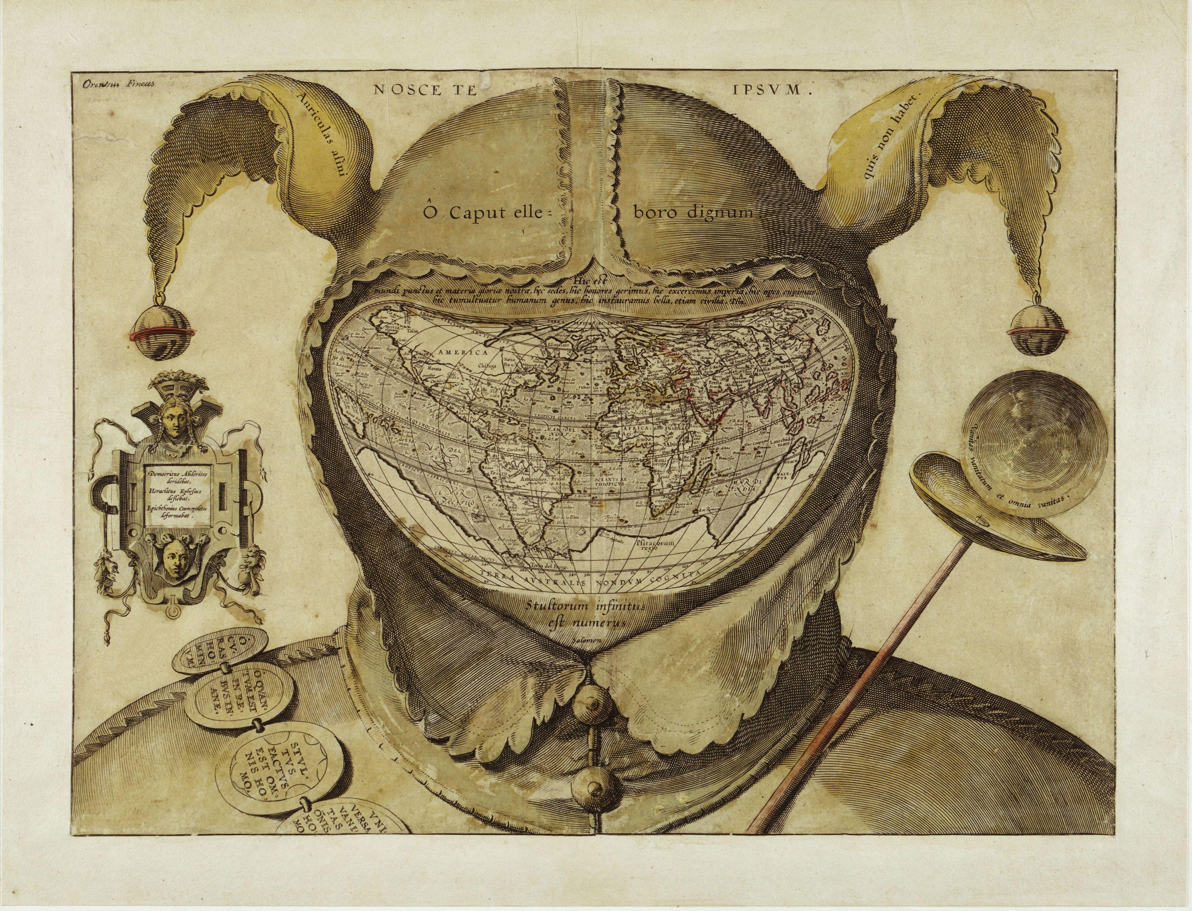
Fool’s Cap Map of the World

Fool’s Cap World Map

This startling and disturbing image is one of the enigmas of cartographic history. The artist, date and place of publication are all unknown, and one can only guess at its purpose. The geography of the map strongly resembles that of the world maps of Ortelius published in the 1580s, giving a tentative date of c. 1590. This is the earliest known use of the world map in a visual joke. Its central visual metaphor is the universality of human folly and various mottoes around the map reinforce that theme. The panel of the left says: “Democritus laughed at it [i.e. the world], Heraclitus wept over it, Epichtonius Cosmopolites portrayed it.” Although Epichtonius Cosmopolites appears to be the author’s or artist’s name, it translates roughly as “Everyman,” leaving the mapmaker’s true identity hidden.

A strong legacy of the theme of the Fool exists in literature and popular art from the fourteenth to seventeenth centuries. The Fool was licensed to break rules, speak painful truths and mock power and pretension, and the grotesque shape he bore was a kind of living punishment. This frame of reference would have been quite familiar to the audience of this engraving in the 1590s. And people would have recognized in this map a radical visual interpretation of the Fool’s role: it is now the whole world that takes on the Fool’s costume, thus forcing the viewer to confront the possibility that the entire created order is irrational, alien and threatening.

Adapted from the book The Image of the World: 20 Centuries of World Maps by Peter Whitfield (Pomegranate Artbooks, 1995)


Found Here: http://myweb.dal.ca/jpekacz/maps.html

This rather sinister image is one of the biggest mysteries in the history of western cartography. Most often referred to simply as the Fool’s Cap Map of the World, it is unknown why, when, where and by whom it was made.

The only thing that can be said about it with some certainty is that it dates from ca. 1580-1590. But sources even differ as to the type of projection used, some referring to it as ptolemaic (i.e. equidistant conic), others claiming it owes more to the techniques of Mercator and/or Ortelius (and being an enthusiast rather than a specialist, I’m not one to call this).

The map shows the world ‘dressed up’ in the traditional garb of a court jester: the double-peaked, bell-tipped cap (1) and the jester’s staff (2). The face is hidden (or replaced) by the map, giving the whole image an ominous, threatening quality that feels anachronistically modern.


The archetype of the Fool, presented here in his incarnation as the court jester, is a first indicator of the map’s deeper meaning. In previous ages, the Fool was a court figure allowed to mock majesty and to speak truth to power. These were rare and useful correctives to the corrupting absolutism of the monarchies of the day. But criticism of this sort was only possible if it was de-fanged by the grotesque appearance of the Fool - preferably a hunchbacked, slightly loopy-headed dwarf, i.e. someone not to be taken too seriously.

All of this would have been common and current knowledge to the people viewing this map, in the late 16th century. The uncomfortable truth told by this map is that the world is a sombre, irrational and dangerous place, and that life on it is nasty, brutish and short. The world is, quite literally, a foolish place.

This is underlined by the mottoes of biblical and classical origin, dotted across the map. The

legend in the left panel reads: “Democritus of Abdera laughed at [the world], Heraclitus of Ephesus wept over it, Epichtonius Cosmopolites portrayed it” (3). Over the cap is the Latin version of the Greek dictum, “Know thyself" (4). Across the cap’s brow, the inscription translates as “O head, worthy of a dose of hellebore” (5).

The Latin quote just above the map is from Pliny the Elder (6): “For in the whole universe the earth is nothing els e and this is the substance of our glory, this is its habitation, here it is that we fill positions of power and covet wealth, and throw mankind into an uproar, and launch wars, even civil ones.”

The reason for so much trouble and strife is explained in the quote below the map, from Ecclesiastes: “The number of fools is infinite” (7). Another quote from that most depressing of Bible books, on the jester’s staff to the right, intones: “Vanity of vanities, all is vanity” (8). Inscribed on the badges adorning the shoulder belt are a few sayings in line with this cheerful message: “Oh, the worries of the world; oh, how much triviality is there in the world” (9), “Everyone is without sense” (10), and “All things are vanity: every man living” (11).

For some researchers, the sum of these messages, as well as their presentation in a cartographic setting, point to a little-known Christian sect called the Family of Love. This clandestine group is said to have numbered the Flemish cartographer Ortelius in its ranks. If this map is anything to go by, the Family of Love must have espoused a rather harsh and pessimistic view of the world, and of humanity’s place in it.

But much remains conjecture, as indicated also by the last piece of this cartographic puzzle - the name written in its top left corner: Orontius Fineus. This name (the Latinised version of the French name Oronce Finé) is associated with a map dated 1531, purportedly showing an ice-free, river-rich Antarctica. Why would the name of this cartographer crop up on a map made decades later? Could he have been the mapmaker (12)? Or is he the one being made fun of?

Many thanks to J.B. Post for alerting me to this map. Many versions to be found online, this high-resolution image found here at Coin des cartes anciennes.

------------------------------------------------------------------------------------------------------------------

(1) the donkey’s ears referring to the supposed stupidity of the ass. Inscribed on them is the quote Auriculas asini quis non habet, meaning “Who doesn't have donkey's ears?" This witticism is ascribed to Lucius Annaeus Cornutus, a Roman stoic philosopher from the 1st century AD.

(2) a parody of the royal staff, a symbol of authority.

(3) Democritus Abderites deridebat, Heraclites Ephesius deflebat, Epichthonius Cosmopolitus deformabat. Epichtonius Cosmopolites seems to refer to the maker of the map, but actually means something like ‘Everyman’.

(4) Nosce te ipsum, in Greek: gnothi seauton. According to Pausanias, an inscription on Apollinic temple at Delphi.

(5) O caput elleboro dignum. Hellebore is a family of mostly poisonous plants, some of which have been used medicinally since Antiquity. It is reputed to induce madness.

(6) Hic est mundi punctus et materia gloriae nostrae, hic sedes, hic honores gerimus, hic exercemus imperia, hic opes cupimus, hic tumultuatur humanum genus, hic instauramus bella, etiam civica. From Book 2, Chapter 72 of the Naturalis Historia (‘Natural History’) by Caius Plinius Secundus.

(7) Stultorum infinitus est numerus (Ecc. 1:15).

(8) Vanitas vanitatum et omnia vanitas (Ecc. 1:2).

(9) O curas hominum, O quantum est in rebus inane, the opening quote of Aulus Persius Flaccus’ Satires.

(10) Stultus factus est omnis homo (Jer. 10:14).

(11) Universa vanitas omnis homo (Psalm 39:6).

(12) Not likely; his dates are 1494-1555. Or could the map predate its estimate by about 30 years?

Found Here: http://bigthink.com/ideas/24015?ref=nf

Saturday, September 4, 2010

The Alexander Mosaic, 1st Century BCE, Pompeii

Wear patterns on one of the most celebrated mosaics of antiquity have allowed researchers to reconstruct exactly how ancient Romans viewed the artwork.

Found during the 1831 excavations in the lava-buried town of Pompeii, the Alexander mosaic (now on display at the National Archaeological Museum in Naples) is the most famous example of an early tessellated mosaic.

Measuring 19 feet by 10 feet, the piece was made around 100 B.C. out of roughly 4 million tesserae (small mosaic tiles).

The artwork once decorated the floor of a room in the House of the Faun, one of Pompeii's grandest residences.

The tiny tesserae, applied following the "opus vermiculatum" technique (basically set in worm-like rows), depicted a dramatic scene from a battle between Alexander the Great and the Persian king Darius III.

"Although there is some disagreement as to exactly which battle the mosaic depicts [either the Battle of Issus in 333 B.C. or the Battle of Gaugamela in 331 B.C.], we know many things about this mosaic. For example, it is uniformly agreed [that the mosaic is] a copy of a famous Hellenistic painting executed sometime around 300 B.C.," Martin Beckmann, of the University of Western Ontario, Canada, told Discovery News.

"What is less know is the mosaic's role as a floor surface in an Italian house. In this role, it has the potential to provide evidence of the tastes, interests and desires of the wealthy Romans during the late Republic," Beckmann said.

In his study, presented today in Anaheim, Calif., at the annual meeting of the Archaeological Institute of America, Beckman looked at some large, entirely destroyed areas of the mosaic.

These areas were filled in ancient times with mortar and have been in the same condition since they were originally discovered.

Beckmann identified four mains pattern of wear: a large, crescent-shaped area around the portrait of Alexander, two patches in the upper portion of the mosaic and two other patches in the lower portion.

"The patches basically show us the mosaic through the Romans eyes, and tell us what interested the ancient viewer. Although Darius is the most prominent figure in the mosaic, the Romans were much more interested in Alexander," he said.

"They were also apparently fascinated by the plight of two Persians crushed beneath Darius' chariot, especially one who is shown with his face turned from the viewer but reflected in a shield -- a skillful artistic trick," he added.

"There is clear evidence of multiple ancient repairs in these damaged areas. The most recent restorations filled the gaps with mortar, while more ancient repairs used tesserae," Beckmann said.

According to Beckmann, the repairs tell a story. They indicate that the mosaic had been damaged by overuse, and often in exactly the same areas.

"Over time, even careful footsteps would have loosened the very small stone tesserae from their tenuous hold in the mortar of the mosaic's bedding. At least once, substantial repairs were attempted, but clearly by the first century A.D., these had been given up in favor of simple patching with plain mortar," Beckmann said.

The two upper patches of wear even allowed Beckmann to reconstruct a theoretical "tour" of the mosaic. Here is Beckmann's explanation:


Alexander Mosaic


Once the visitors had entered the room -- we might imagine a group of dinner-guests led by their host -- the tour would begin with Darius and his Persians.

The host would have stood above Darius' horses
(1), explained why the great king was fleeing, and pointed out the artistic novelties in the lower portion of the mosaic.

The guests would have milled about at the foot of the mosaic, taking in the overall scene, and then briefly concentrated themselves around the figures of the two doomed Persians (a - b).


Persian soldier b) A Persian soldier is about to be crushed beneath Darius' chariot. The Romans were particularly interested in the reflection of the Persian's face in the polished shield, a skillful artistic device employed to highlight the pathos of the scene.

Persian soldier
a) The Romans were interested in the figure of the unfortunate Persian who crouches below the horses, surely about to perish beneath their hooves. Presumably the extreme nature of his plight attracted their attention.


Then the host moved to the left and stationed himself in the area above the figure pair composed of Alexander and the unfortunate Persian he is spearing2). (

The guests marched right onto the mosaic and crowded around the image of the Macedonian king, standing right on top of his body (c ), being careful however not to step on his head or that of his horse.

The guests arranged themselves in a semicircle, so as to leave a line of sight open between them and their host, who was also able to see Alexander's head from his vantage point above.

Here the guests stayed the longest and here is where the ancient tour would end.


Found Here: http://news.discovery.com/archaeology/how-the-alexander-mosaic-was-used.html

Monday, August 30, 2010

Stephan Balleux - Paintings

Can there be such a thing as painting that swallows its own tail? I was wondering about this after visiting the studio of Stephan Balleux. I had seen paintings that could not ignore their own existence. Whatever else they represented, they always made explicit play of the action of painting: the gesture preserved in paint. There were two nearly finished portraits in the studio. Here and there the palette slipped from its black-and-white into colour; a dark purple that crept into the top of the picture, like the imminent purple of the falling night; or faintly beige tinted legs standing out against a white dress. It was as though you were viewing the first intimations of colour in a world that hitherto existed purely in black and white. The portraits were from a family album; they had something of the atmosphere of old-fashioned photographs in which children, awed by the photographer, pose obediently on a bench or table and peer earnestly at the lens. In this case they were not photographs but large paintings with the children as their subjects.

There was something uneasy about them. Perhaps it was their serious gaze, or perhaps it was an effect of the colour that was sneaking into the image, like the presage of a new era. Or was my reaction due to the strange, twisted objects that appeared, like that in the little boy’s hand or on the table next to the girl? They were mere knick-knacks, like little sculptures made from congealed, twisted paint. There it was: art biting its own tail, shaking itself by the hand, allowing the intrusion of painterly matter into an otherwise photographic space. The work of Stephan Balleux dramatizes the activity of painting. You see an obvious stroke of applied paint; or at least you think you do. Whether you are looking at a portrait, an interior or a relatively abstract play of forms, that explicit brushstroke always turns up; sometimes lavishly, over the whole canvas, and sometimes in a mere detail, a knick-knack, a casually hand-fashioned object left on a table. There is always a gesture that reminds you: this is painting. Why that emphasis? It’s nothing new in itself, this visible impasto which shows how a painting came about. Consider the rough, tortured touch of the expressionists or the loose écriture of the impressionists. Consider Cézanne, and how he could make the light vibrate in a landscape by the genius of his tremulous painter’s hand. These are all products of a painterly touch that claims independence from the represented subject. Look and you will find copious examples in modern art. But something else is involved here. Balleux differs in that his brushstroke is an illusion. It is not what you think you see. Instead of a spontaneous stroke of paint, you are looking at a picture of a brushstroke, an imitation of a painterly handwriting. It is a faux brushstroke, a brushstroke that is play-acting itself. This aside, Stephan Balleux also paints figurative images and sometimes tackles classical motifs. This saves his work from mere conceptual narcissism.

A rose, a group of people, a portrait, a skull, another skull, an interior: they are images that have something to say, which are beautiful and menacing. They are sweet yet at the same time repellent, sometimes symbolic and sometimes suggestive. The image is in some cases no more than a colourful form which possesses the whole canvas with its dramatic energy. Layer by layer, it is a painting process that advances patiently, even if it sometimes looks bold and immediate. There is a skull in the studio, which the artist casts as a model, of which he takes a photograph, which he then uses as the basis of a painting. Layer by layer the painting takes shape, first the drawing, then the paint, then more paint, until everything looks fluent and effortless. Balleux employs illusionist devices. That is just what you would expect of the ‘clever’ kind of painter, one who paints so dextrously that you would scarcely realize that the canvas had been painted if he did not continually reminded you of the fact. Balleux not only studies the old masters and their painterly technique, but investigates what photography and video have to offer him, and how classic sculpture and three-dimensional digital representations relate to one another. And he expresses all this in paint and in the illusion of paint. Perhaps he is the kind of painter who is a bit of a philanderer, one who is forever straying off with some other medium, hungry for experience and new expressive opportunities. But in the end he comes back to his true muse, the art of painting. He cannot help it because he loves her. In Pompeii, I saw casts of people trapped in the eruption of Mount Vesuvius in 79 AD. The figures had an intimacy that was almost embarrassing. It was as though I were witness to something not meant for an outsider’s eyes; people, their outward form immortalized at the moment of their extinction. At the same time, it occurred to me that these were casts many a sculptor might envy, so compellingly did they combine life and death in a single object. I had to think back to Pompeii when I saw how Stephan Balleux uses paint to make not only paintings, but also sculptures and reliefs, of human torsos, heads and skulls. They resemble people congealed in paint, like individuals overwhelmed by some inescapable torrent of fluid colour. The sweeping motion is still visible yet they are now motionless.

Do not speak of Gerhard Richter if the painter is in a bad mood. Anyone who paints today with some awareness of how our vision has become partly photographic cannot get around Richter. You may first think of other painters when seeking parallels for Balleux’s twisted beings and morbidly proliferating shapes, but under the surface it is Richter who counts, and counts like no other. He is the begetter of a generation when it comes to the art of tightrope walking between photography and painting. So must the father die before the son can prosper, before he can find his own way? Maybe the painter toys with the notion of artistic patricide. He presumably shares the master’s interest in photographic effects such as selective focus and blur, or must at least acknowledge a debt to him. The painterly style is one that gains its vigour by embracing the power of the photographic gaze instead of repudiating it. But then something happens with Balleux, that tail-swallowing act, that backward glance over the shoulder, that making a drama out of the act of painting; for example when he imitates the painterly brush-stroke with photographic precision. What serves Balleux well is moreover that he is no stranger to the weird and wonderful. That makes the road he has chosen an unusual one. He has a keen eye for alienation and that is what he sees and portrays in his fellow man. It emerges in the way he exaggerates the faces, dead or alive, in the way he makes them melt, makes them volcanic. Man is a monster, even if he wears a tailored suit. There is another factor in the content of this work. It is the concentration with which the artist makes it, his dedication one might say. Perhaps it is this painter’s greatest talent. When I look at his work, besides looking at a subject and at a self-conscious painted surface, I see patience, precision, control and professional mastery. It is these qualities that bridle the tortuous, volcanic imagination underlying the images. The resulting tension is a pleasing one. The artist once described his painting as a virus. Willy-nilly it spreads one work to the next. Every image he touches is infected, becomes paint-stricken. That is the respect in which his work swallows its own tail; it forms a closed circle. However videomanic or photo-addicted the image may be, it always veers back to painting.

Jurriaan Benschop

Found Here: http://www.stephan-balleux.com/about/texts

Friday, August 27, 2010

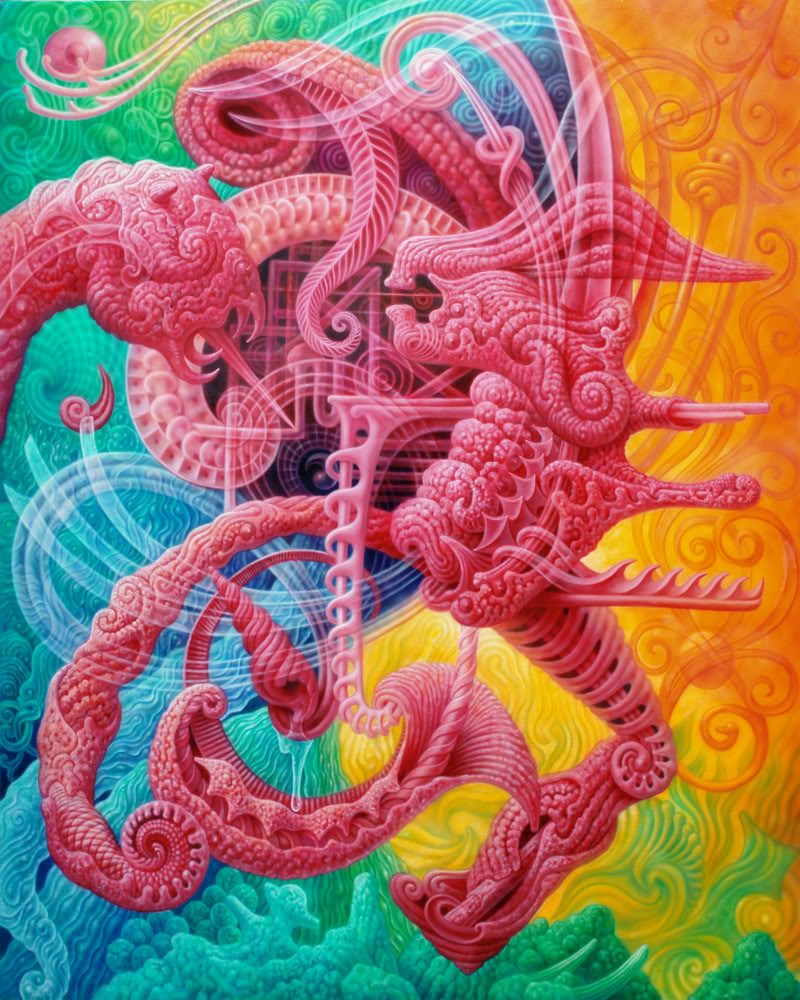
Satoshi Sakamoto - Sur-naturalism

The introduction of Sur-naturalism

 Sur-Naturalism is my style of art, attempting to emancipate and direct life's power and potency through pure forms and colour. It strives to represent the archetypes that are ever-present in nature. I use red to re-create the vital experience of initiation into a world where all living things act as stimulus for the human soul. Like magma and blood, red declares a duel between internal nature and externalnature. We can see said contrast in the red shrines of Japan, with the green forests surrounding them. The solemn art of the past, such as ancient Japanese earthenware, drew me to meditate upon the mythology from which it was inscribed. The paintings often reflect my experiences derived from karma,rooted in the duality between man and woman, killer and victim, mortals and nature.

Found Here: http://www.myspace.com/maxoputer

Satoshi Sakamoto

I was born in the northern Japan in 1970. The culture of Aomori prefecture where I raised is different from the typical well known Japanese culture from Kyoto. The most popular summer festivals, Nebuta and Neputa represent primitiveness in such vivid colors and dynamic movements.


In high school, I was inspired by a book of paintings by HR Giger and the ideas of Rudolf Steiner. In art university I studied classical techniques and tried to use an airbrush and oil paints in exploring my own style; Sur-naturalism which is based on the primary colors and abstract archetypes..

My faith has been shaped by exploring the internal realms of creation; not relying on outer influences or the past. It might share the motivation of the artists who tried to develop abstract art in the early 20th century. The work to continue gazing at the darkness has been extremely difficult. In the mean time, I feel uncomfortable about the landscapes standardized by modernization. The beauty of tradition in?the artificial has been becoming too inferior due to commercialism and industrialism. This is the reason why I keep my images independent of outer environment as a conservative reformism.

Ultimately 2 dimensional art should help create blue-print for 3dimesional objects which could be realized in the future. Art is laid between the natural and the artificial. It is unavoidable that art carries a role in directing the shape of manmade things and nature. My ambition is not to be in galleries or museums but to be in the fundamental places where we live, like our houses and offices, or the shrines and the festivals.

. I am curious about the artworks of the past, like ancient Japanese earthenware. It suggests to me that immortal archetypes in chaos could show us a mythology far beyond our words. I believe that primitive art works already achieved higher states than any other modern art. I think that the designs by ancient people were implicated to karma with the shapes of duality which meant woman and man, killer and victim. Those are reflected in my paintings subconsciously as well.

I chose red to recreate the experience of initiation into a place where all living things are activating our souls. Red also means anger and mercy, or destruction and creation. In this area we can’t distinguish the boundary between the inside and the outside. I have imagined that Japanese red shrines intimate our red blood which contrasts against the green forest. I thought red and green means a reversible relationship between internal nature and external nature.

Sur-nature and Super-nature are not the same. Sur-naturalism is a method of possibility to deal with primary phenomena within nature including the self of humankind. The sense for the archetypes is a key to open the secrets. As opposed to the supernatural, it can be perceived and understood in its entirety.

Found Here: http://www.hdfest.com/artist/satoshi.html